Color Drenching: The Sculptural, Saturated, Sensory Reawakening of Early 2026
- InterLux Interiors
- Dec 23, 2025
- 8 min read
The beginning of a new year always carries a particular kind of electricity. Even before the calendar turns to January, something starts to stir — a hunger for renewal, a quiet longing for clarity, a desire to feel grounded again after the rhythm of the holidays. But the transition into 2026 feels unusually significant. It is not just a symbolic shift; it is an emotional one. People are looking at their homes with a different sensitivity, a deeper awareness of how much their spaces influence their state of mind, how much atmosphere affects their energy, how much color shapes their daily emotional landscape.

In this early chapter of 2026, the dominant desire among luxury homeowners is not simply to redecorate — it is to recalibrate. They want to feel restored. They want to feel anchored. They want softness without sterility, richness without noise, personality without chaos. They want a home that behaves less like a showroom and more like a sanctuary. Something that holds them as much as it expresses them.
And this is where one design language rises above all others with extraordinary resonance: color drenching — the complete, immersive saturation of a room in a single hue or tonal family, executed with such depth, softness, and architectural intelligence that color becomes a full sensory atmosphere rather than an accent.
Color drenching is not new to the design world — but in 2026, it becomes newly powerful. It becomes newly relevant. It becomes newly necessary. In the hands of InterLux Interiors, it evolves from a stylistic gesture into a philosophical lens, a psychological tool, a sensory strategy, and ultimately one of the most luxurious and emotionally sophisticated approaches to interior space the firm has ever championed.
Color drenching in 2026 is not about drama. It is about depth. It is not about boldness. It is about immersion. It is not about loud choices. It is about emotional coherence. It is not about trend. It is about how people want to feel — as the new year begins, as spring approaches, and as interiors become more intimate, more personal, and more sensorially grounded than ever before.
This is the long, layered story of color drenching. This is the story of early 2026.
The Emotional Reset of 2026: Why Color Feels Like the First Step
Every January carries an emotional symbolism — the slate wiped clean, the edges softened, the mind reorganized around new ambitions. But this year, the reset is more psychological than aspirational. People are overwhelmed. They are overstimulated. They have endured years of design trends that celebrated eclectic contrast, maximal layers, fragmented palettes, and high-impact moments designed for social media more than real life.
But as 2026 begins, homeowners want something else entirely: coherence.
They want a visual field that exudes calm rather than chaos. They want simplicity without compromise, clarity without coldness, quiet without emptiness. And color drenching emerges as the perfect antidote — because it replaces fragmentation with immersion. It replaces noise with atmosphere. It replaces conflict with harmony.
When a room is drenched in a single hue, something inside the body relaxes. The eye stops searching for contrasting elements. The nervous system stops bracing for visual interruption. Even the breath becomes softer. There is a sense of being held, cocooned, enveloped — not by darkness or heaviness, but by unity.
Color drenching is less about making a statement and more about creating a psychological landing place. It is the architectural equivalent of sinking into a warm bath: total immersion, complete softness, and emotional recalibration.
This is why it resonates so strongly at the beginning of 2026. It reflects what people need more than what design trends demand.
Immersion and the Human Mind: The Psychology Behind the Movement
To understand why color drenching feels so comforting, you must understand how the human brain processes space.
The eye scans constantly. Even in a calm room, the mind is mapping breaks in color, contrast, edges, corners, transitions, interruptions. When there are many competing colors, the mind never fully rests. It is subtle, but the effect is cumulative. Visual fragmentation becomes emotional fragmentation.
Color drenching eliminates fragmentation entirely.
A monochromatic room reduces cognitive labor. It creates a continuous visual pathway. It quiets the mind because there is no competition for attention. Everything belongs. Everything matches. Everything informs a single emotional message.
This is why people instinctively describe drenched spaces as “calming,” “warm,” “comfortable,” “soothing,” “relaxing,” or “grounding.” They are not reacting to the aesthetic as much as they are reacting to the neurological ease the space provides.
InterLux Interiors often describes this as the emotional intelligence of color. Color drenching is not about pigment — it is about the feeling a pigment creates.
It is not decorative. It is psychological. It is architectural. It is emotional. It is human.
Color as Architecture, Not Decoration

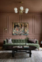
In 2026, color has transcended its old role as an accent or complement. It is no longer the “last decision” made at the end of a design plan. In luxury homes — especially those crafted by InterLux Interiors — color is behaving like architecture.
Inside a color-drenched room:
Walls feel sculptural. Ceilings become part of the mood. Trim disappears into atmosphere. Millwork becomes monolithic. Shadows become volumetric. Light becomes emotional.
Color is no longer just something you see. It becomes something you inhabit.
The room becomes a tonal world — a complete environment with a distinct personality and emotional vocabulary.
This is why drenched rooms feel expensive even when nothing inside them is overtly ornamental. The saturation itself conveys fullness, completeness, intention, and architectural integrity.
Color has become form.
The 2026 Palette: The New Emotional Neutrals
What makes early 2026’s approach to color so compelling is the shift toward tones that feel deep enough to create atmosphere, but soft enough to stay timeless. These are not loud, aggressive, bright colors. They are atmospheric, sensual, grounded, and emotionally articulate.
In homes designed by InterLux Interiors, these hues behave like emotional neutrals:
Plum that feels like velvet. Eucalyptus that feels like inhaling a forest. Clay browns that feel warm and elemental. Shadowed greys that feel like fog. Midnight teals that feel like dusk. Caramel and sand that feel sun-warmed and soft. Ink blues that feel nocturnal and introspective.
What these tones share is a kind of lived-in sophistication — subtle, poetic depth with emotional intelligence. They feel like the new luxury: not performative, not sensational, but deeply atmospheric.
In the early months of 2026, these tones align perfectly with the seasonal transition from winter introspection to spring awakening. They carry both the depth of the colder months and the freshness of the approaching light.
They are colors that breathe. Colors that hold shadow beautifully. Colors that glow with evening light. Colors that shift with seasonal moods. Colors that feel like emotions, not pigments.
The Sensory Intelligence of Drenched Rooms
One of the great misconceptions about color drenching is the idea that monochromatic means monotonous. In reality, it is the opposite. A saturated room becomes a sensory landscape — not through color variation, but through texture, finish, shadow, proportion, and light.
InterLux Interiors approaches each drenched space as a layered sensory composition. The walls might be matte plaster, absorbing light into soft, velvety gradients. The millwork may be painted in the same hue but with a subtly different sheen, catching light where the walls swallow it. Stone surfaces may echo the color in veined, tonal variations. Upholstery may deepen the palette with tactile richness. Rugs may anchor the palette with warmth and softness.
Without a single color break, the room becomes dynamic, dimensional, and visually rich — not through contrast, but through rhythm.
Texture becomes the new contrast. Light becomes the new punctuation. Shadow becomes the new ornament. Materiality becomes the new pattern.
Color drenching does not flatten a room. It deepens it.
Light: The Silent Collaborator

No color-drenched interior is complete without thoughtful lighting. Light determines the emotional temperature of saturated rooms. And in early 2026, lighting design is undergoing its own quiet revolution — toward softness, warmth, and sculptural ambience.
InterLux Interiors designs drenched rooms with lighting that behaves like mood, not illumination.
Warm sconces grazing textured walls. Dimmed overheads dissolving into shadow. Table lamps turning corners into intimate moments. Ambient glows revealing curves and softening edges. Underlit millwork creating quiet gradients.
In a monochromatic space, light behaves differently — it blends, envelops, cocoons. It pulls the color forward in some areas and pushes it back in others, creating a living, breathing atmosphere.
Light becomes emotion. Color becomes presence. The room becomes a sensory poem.
Why Color Drenching Feels So Much Like “New Year Energy”
There is something symbolic about wiping a room clean of contrast and choosing to commit to a single hue fully, intentionally, unapologetically. It mirrors the emotional process of the new year: stripping away what doesn’t serve, refining what does, and leaning into clarity, confidence, and coherence.
Color drenching mirrors that psychological process.
It asks: What do you want this room to feel like? What does your spirit want when you walk in? What emotional note do you want to hit each day?
It invites a depth of intention that aligns perfectly with early-year desire for realignment and new beginnings.
In the hands of InterLux Interiors, color drenching becomes a ritual of renewal — the interior equivalent of setting a sacred intention. It clears the noise. It centers the space. It defines the purpose. It anchors the year.
Seasonal Synergy: How Spring Light Transforms Color-Drenched Rooms

Spring light is warmer, softer, more diffused. It moves across drenched walls like a slow watercolor — revealing undertones, shifting gradients, waking up subtle complexities in the pigment.
In winter, the same room feels introspective and moody. In spring, it feels luminous and alive.
This seasonal transformation is one of the reasons color drenching is so emotionally resonant in early 2026. It gives homeowners a palette that evolves, grows, and shifts with the natural world — making the room feel alive rather than static.
A plum library becomes deeper with cloudy winter mornings and romantic with golden spring afternoons. A eucalyptus bedroom feels grounding in January and rejuvenating in March. A clay-toned dining room feels warm during winter dinners and sunlit during spring brunches.
Color drenching is not static. It is seasonal. It is alive.
Where Color Drenching Thrives Most in 2026
While the technique can be applied anywhere, certain spaces bloom under saturated tones — especially during the quiet months of the year.
Libraries become emotional sanctuaries. Bedrooms become immersive cocoons. Dining rooms become sculptural evening experiences. Foyers become dramatic arrival moments. Powder rooms become intimate jewel-box escapes. Lounges become sensorial retreats.
These are the rooms that crave atmosphere rather than lightness, mood rather than neutrality, presence rather than performance.
They are rooms that benefit from emotion.
Why Color Drenching Is the First Major Luxury Language of 2026

There are design movements that come and go. And then there are movements that emerge because the culture needs them.
Color drenching belongs to the latter.
It is rising in early 2026 because people crave depth, calm, immersion, identity, sanctuary, and emotional coherence.
It is not about taking risks — it is about taking back control of the emotional atmosphere inside the home.
It is not about decorating — it is about designing how life feels.
InterLux Interiors understands this shift intimately. For the firm, color drenching is not color theory — it is human theory. It is not pigment — it is psychology. It is not style — it is emotion.
This is why the firm executes it so masterfully. This is why clients respond to it so viscerally. This is why it sets the tone for the new year. And this is why it will define the luxury language of 2026 long beyond spring.
The Sensory Rebirth of the New Year
Color drenching is not a design trend. It is a sensory rebirth. It is a return to emotional clarity. It is a celebration of depth, intimacy, and coherence. It is the architectural expression of the new year’s most powerful longing: the longing to feel grounded, centered, soothed, and expressed inside the home.
A drenched room is not about aesthetics. It is about atmosphere. It is about presence. It is about belonging. It is about feeling.
And nothing captures the spirit of early 2026 more than spaces that feel like they were built for the soul, not for the photograph.
Color drenching is the language of that soul. And in the hands of InterLux Interiors, it becomes art — immersive, emotional, architectural art that whispers rather than shouts, envelops rather than overwhelms, and transforms a room into a world.
This is the design story of early 2026. And this is only the beginning.